New Client: Creative Vision

New Client: Creative Vision

We are excited to announce we’re evaluating a project with Creative Vision that delves into the rich oral history and heritage of Indian restaurants and the vibrant Bangladeshi community in the UK. Working in Luton, the project aims to capture the experiences of chefs, owners and community members who contributed to Indian Cuisine and culture in the UK.

These experiences will be brought together to create a book, containing real stories and interviews of Indian heritage in the UK.

We’re working with the project to evaluate and measure the impact on audiences, volunteers and participants and share our expertise in working with a wide range of communities.

Eid Mubarak

Capturing impact in people’s own words

At The Evaluator we recognise the value of collecting qualitative information for our evaluations. We take pride in capturing the genuine impact our projects or organisations have on individuals through hearing about their experiences in their own words.

The questions we ask are often simple and open to encourage individuals to speak honestly and let their stories unfold naturally. We feel privileged to get to hear about the amazing feedback and stories from people, and we love to share these stories with our clients.

We would also like to share some genuine quotes with you, spoken by real people who have experienced the impact from some of our clients:

We have heard from volunteers

“I truly appreciate everything the team does throughout the year to keep things moving forward. Thank you for helping to make so many people feel empowered, and seeing all of the work being done leaves me feeling so much hope for the future. Thank you for shining a light on all that can be done to make live music more accessible and equitable!” – Volunteer

“That was the biggest opportunity I’ve been given and that changed my life” – Volunteer

“It is such a joy and has made a really positive impact on my life. It has even changed the direction of my career” – Volunteer


We have also heard from participants


“For my general health I consider [client] more important than the NHS” – Participant of a wellbeing service

“[Client] has just been a godsend for me. Absolute Godsend” – Participant of a wellbeing service

“I really enjoyed the course as I love art and it also gave me a push to get out of the home and socialise more thus contributing to my wellbeing. Thank you”  – Participant of an Arts project

Thank you for the opportunity. Since starting with [project] I’m growing in self confidence and feel like I’m getting my life in order again. I’m putting plans in place and I’m more optimistic for my future.” – Participant of an Arts project


If you’re interested in learning more about our evaluation processes or exploring how we can help your organisation measure its impact, don’t hesitate to reach out. We’d love to chat!

What are the Indices of Multiple Deprivation?

What are the Indices of Multiple Deprivation?

If you have ever read one of our reports, you’ll likely see reference to something called the Indices of Multiple Deprivation, or ‘IMD’.

We use the IMD as a powerful tool to analyse and understand the barriers and socio-economic status of audiences, participants, and volunteers. We use postcodes to measure the IMD status, and this means that people find it easy to answer. This does mean that we are looking at the household status too.
The results give our clients an idea of which people they are attracting to their projects and what barriers they may be facing in life.

Statistically, people who live within areas of greater deprivation have more barriers in their lives and are less likely to engage with the arts and nature and are more likely to have greater issues with their wellbeing. That’s one of the reasons funders do like to understand if projects and organisations are reaching people from the most deprived areas.
How are the indices of multiple deprivation worked out?
The IMD is worked out using a range of factors which are assessed across the UK and given a score. The factors are listed below:

  • Income deprivation: how many people in the area are experiencing low-income levels.
  • Employment deprivation: what is the rate of unemployment in the area?
  • Education deprivation: what are the average qualifications within the area, and how easy is it to access quality education?
  • Health deprivation and disability: what is the average life expectancy and disability prevalence in the area?
  • Crime: how much crime occurs within the area
  • Housing deprivation: how affordable is housing within the area, and are there other barriers to people accessing housing
  • Living environment: what is the air quality like in the area, and are there green spaces?

These scores are compiled to give a ranking, which are then categorised into ten deciles. The entirety of England falls equally into one of ten deciles, with decile 1 indicating the most deprivation, and area 10 having the least deprivation.
If you were targeting deprived areas, you might want to reach 50% of people living in IMD1 and 2 for example. Or if you wanted a perfect section of the UK represented in your project, you might want to see 10% of your audience from each decile.

We think the IMD is a useful tool and aim to use it in every evaluation where relevant.

72 Seasons – February

72 Seasons – February


Did you know that being outside and simply noticing nature can significantly enhance our well-being? However, with the hustle and bustle of our daily lives, we can easily fall out of the habit of spending time in nature.

What if you don’t have any time? You might be a busy parent, you might work long hours and only walk to the bus stop and back. You might have to spend more time at home due to ill health. You might be studying hard at the moment.

Whatever you have going on, if you have lots of time or no time at all, 72 Seasons is a simple way to connect more with the nature around you.

72 Seasons encourages people to notice the subtle changes that take place in their surroundings every four or five days, (creating a total of 72 mini-seasons). Once a month, we’ll share the current season you can look for in your day-to-day, fitting around your life. You can look for the season as you’re driving to work, taking the kids to school, walking the dog, or taking a walk for yourself.

To stay updated with all the changes, you can follow the live seasonal changes on our social media channels such as Instagram, Facebook, and X.

 : facebook.com/groups/72seasons

twitter.com/kirstyevaluator

: instagram.com/72seasonsuk/

Website – www.72seasons.co.uk

To start your nature-noticing journey, here’s what to look for in February:

30 January – 3 February: Morning Grass Glistens

Next time you are out and about one morning, try and get a bit closer to the ground and see if you can see any dew drops shining in the sunlight. Depending on how much of an early bird you are, you might even manage to time this to coincide with ‘golden hour’ – the first 15 minutes or so after the sun rises when the world is bathed in a beautiful soft light, which can feel a bit golden. Even if you don’t catch the light, try and take a moment to appreciate the individual shapes of the grass stalks.

Recent Workshop Feedback

In December 2023, The Evaluator worked with Pendle Borough Council to revitalize their Creativity and Cultural Strategy. We pulled together data across various themes and subsequently organised and conducted two workshops. These sessions played a pivotal role in refining existing concepts and co-creating an effective action plan for strategy implementation.

Kerry, representing Pendle Council, had this to say, “It is really wonderful working with Kirsty. Her understanding and approach really worked for our group, and the sessions were focussed but flexible enough to let some great conversations emerge. It has been valuable for everyone involved.”

Cheers to a Festive Break: Wrapping Up a Year of Amazing Projects!

As the year draws to a close, we reflect on how grateful we are to work with such outstanding clients, providing evaluation and data analysis services throughout the year. It has been our pleasure to have been involved in some of the world-changing positive projects our clients have been working on.

In the spirit of the festive season, the Evaluator team will be taking a break to refresh and recharge during Christmas. Therefore, we would like to inform you that our office will be closed for the holiday period starting from the 22nd of December and will resume operations on the 8th of January.

We appreciate your understanding, and we assure you that we will return in the new year fully revitalised and ready to continue delivering our exceptional service.


Below are some of the clients we’ve had the pleasure of working with this year:


Wishing you a Merry Christmas and a Happy New Year!

New client: Community Arts by ZK

The Evaluator is delighted to be working on a new project, Healing Arts for All (HAFA) from Community Arts by ZK.

This project is place focused and based in Pendle, on our doorstep!

HAFA describes itself as a “3-year people powered art and heritage project”, funded jointly by the National Lottery Heritage Fund and the Paul Hamlyn Foundation.  The project will include participants working with professional artists as well as gaining an understanding of working within heritage.  Heritage will focus on understanding the history and impact of Pendle’s Brierfield Mill, an iconic grade II listed former cotton mill built in 1931.  This mill originally attracted the South Asian community to move to the area to work in the textile industry.

You can see more about  Community Arts by ZK on their website here. 

We are particularly looking forward to evaluating the personal impact that this project, blending creativity and heritage, has on the participants from the South Asian community.


Learning about data; Working with quantitative data

In a previous blog, we described quantitative data as data that can be counted or measured in numerical values. A spreadsheet is a good basis for organising data ready for analysis. Now let us imagine you have some data to hand, this is how you might want to try and use it.

Ways to analyse quantitative data.

Example 1: Looking at what the data tells you itself.

We generally start with calculating averages to consider the range of data (the highest score and the lowest score collected).  If we consider 2 sets of data (Data set A and Data set B):

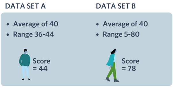
From Data Set A, it is apparent that a similar experience was shared by the large majority of the audience because the average score is 40, but the range is from 36-44. That means the lowest answer was 36, which is quite close to 40 and the highest was 44 which is still quite close to 40.

However, in Data Set B, there was a much wider range of experience.  This should be questioned as to why experiences are so varied, illustrated by the wide range in the data.  Why did some individuals have such a higher score than others? Did some people have a different tutor, or venue, or have more time? There are many reasons why the range could be so high.

Example 2: Comparing data to other national data available.

Another possible way to compare data could be as in the worked example below where the Warwick Edinburgh Scale of Wellbeing was used to measure participant wellbeing.

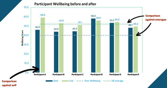
Participants scores were collected over a period of time, firstly at the start of their engagement and then, at the end.  This graph represents a comparison in:

  • Each individual’s wellbeing from the start versus at the end. This is often a reflection of the impact of their engagement.
  • The individuals’ wellbeing who took part versus the national average
  • The individuals’ wellbeing score versus the NHS score of 40 which is believed to be indicative of poor wellbeing.
  • The individuals’ wellbeing versus one another.

Using quantitative data to help with forecasting & future decision making

Using percentages makes making comparisons easier to relate to and understand.

We use an example of a cinema and record audience attendance numbers of time.  Attendance could be affected by the popularity of the content of the film, seasonal trends or weather.  The trend line shows the overall audience is growing and then this line can be used to forecast on at the same trajectory.  This will help you to identify if you are likely to achieve your audience targets.

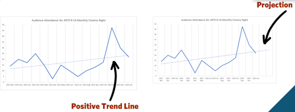
This information can also help you to make decisions about your capacity too and streamline your resources. For example, if you were thinking about moving a cinema location to a larger space, it would be worth looking at the trend line to think about venue size. If you were looking at two venues and one had a capacity of 100, and another 200, you might want to look at what your predicted audience size would be in six months’ time and negotiate the lease or hire accordingly. This is an example of making a data-driven-decision, something we are passionate about at The Evaluator.

Taking notice of negative space in data

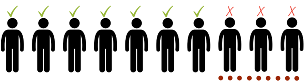
It’s important to take note of the 70% who are agreeing but also to take note of the 30% who are disagreeing and find out why this is the case.  It is worth delving a bit deeper into on the minority and finding out what was the cause of their response.

At The Evaluator, we tend to represent 3 answers ‘yes’, ‘no’ and ‘prefer not to say’ in our reporting. If there’s a high number who indicate that they would ‘prefer not to say’ then it would be suggested they might insecure about completing the survey.  Often their indecision is explained in their qualitative answers and this is worth taking note of when creating future surveys.

Dealing with ‘satisficing’ survey responses.

This is the term we use when people respond with the answers that they think you are looking for and may not read all the questions.  An indication of satisficing is when respondents repeatedly choose 3 when presented with a 1-5 scale. We don’t come across these very often, as we spend a lot of time making sure our surveys are easy to complete, and varied, but if we do spot them, we will try and remove these answers from our data analysis.  It’s important to encourage honesty in answering survey questions.

A final tip

All data can be segmented but you do need to think about the time you have to spend on this as it is time consuming.  In segmentation ideally you are looking for what is more than 10% different to the average. In the example of the graph below, it is worth looking at segmenting to see the results demographics of the areas that are 10% above and 10% below the average line.


Learning about data; What is quantitative data?

What is Quantitative Data?

Quantitative data is data that can be counted or measured in numerical values.  As with qualitative data, there’s a good chance that you already have some collected for your organisation.

You might have collected some of the following:

  • Sign-in sheets
  • Feedback forms
  • Surveys
  • Polls
  • Social media statistics
  • Reports

We often find clients already have quite a bit of data they didn’t know they had collected!

The differences between primary and secondary quantitative data.

There is a distinction between primary and secondary quantitative data.  Primary data is the data that your organisation has collected directly, such as footfall counts or feedback forms. Secondary data is data someone else has collected, for example a national age profile, or a partner shares their footfall data. It can helpful for you to draw comparisons between your collected data and national averages to see how your organisation compares.

Overcoming the challenges of working with quantitative data

There are some challenges to working with quantitative data.  Often the biggest challenge is that it’s not collected in a format that makes it easy to compare to other collected data, or to secondary sources. The best solution for this is to plan in advance and use standardised questions at every opportunity to collect data. The answer format is also important so choosing a standard answer format will make it easier to compare data.

Tracking codes can be useful in identifying if you know the same person will be answering a survey multiple times so you can monitor their progress.  A tracking code can be created within a survey using data such as: a combination of a person’s date of birth and their initials.

It’s always important to date the data particularly for paper copies of surveys which makes identifying the event possible and the data relatable to that event. If one of your feedback forms reveals a problem with the venue or experience, you need to know the date on which that particular event happened to make sure you can address the problem. Don’t forget, feedback forms may be input or analysed as a batch of forms after a few months of collection so it may prove difficult to find out which venue the problem occurred at if you don’t have a way to check.

Managing personal data from surveys

GDPR (General Data Protection Regulation) are regulations which relate to how we retain and use personal data.  Within these regulations it is important to:

It’s important to maintain confidentiality and anonymity with personal information.  Recording date of birth and full name poses a risk to personal identity, however, recording only a date of birth is not identifiable. There are also additional regulations regarding collection data from under 16-year-olds. It is possible to collect identifiable information, but if you do so you need to ensure that the data is obtained with consent, is properly secured and then destroyed once no longer needed.

Thinking about when to collect data

Recording information in the moment is valuable so it can help to set up processes to ensure you don’t miss out! One tactic that works is to have a standard question you ask at the end of every event.  This, and the size of audience questioned can be collected for contextual purposes to see if the responses were representative of the larger audience.

Top tip – you don’t need to collect data from everyone!

Deciding how much data to collect

It’s important to consider whether sample sizes are large enough to provide you with sufficient data to base a decision on.  10% to 20% of the audience is usually a reliable sample size to base a decision on. If you hold many smaller events, it would be advisable to collect evidence from each event and consider it accumulatively to make decisions.